
“How do I drive reg and boost attendance?” is the question every virtual event organizer asks themselves at some point.
Fortunately, we have data on our side. Check out the post below to learn why webinar attendance is changing, plus learn some actionable tips and tactics you can use to enhance your webinar marketing strategy and boost registration for your next event.
How webinar attendance is changing

One of the big learnings from our annual Digital Experience Benchmarks is that audiences register for webinars early. This signals that audiences behavior around registration is starting to return to a post-pandemic “normal.”
That means for webinar practitioners is that promotional cycles for webinars are getting longer requiring more touches, reminders and communications with would-be attendees. Here’s a quick breakdown of of why:
Reminders are paramount
We need to make it easy for audience members to attend our experience. Allowing registrants to add the webinar to their calendars is important as it will free up time on their very busy business schedule.
The next step is to send an email reminder about the event. ON24 always recommends sending a reminder when the lobby opens, which begins 15 minutes before the event. Beyond that, there are different approaches.
Remind registrants the day or week before the event can be helpful if the event is a live certification or if we need attendees to do prep work beforehand. This can make sure that those items are prepared for the attendees to be set up for success.
Pre-event Nurture
With an increasing amount of registrations occurring the week before and more ahead of an event, there is an opportunity to consider a mini-nurture for those attendees to keep them engaged in the weeks leading up to the event.
If the event you’re running is a series, you could direct these “early bird” registrants to watch the previous month’s event or direct them to a content hub with all of the most recent events in this series. Or, if the webinar you’re running isn’t part of a series, consider other related content on that topic, be it webinars, blogs, or e-books, that would be helpful for them to consume leading up the event.
Ask for Feedback
Another option is to get audiences engaged and excited about webinars. Perhaps ask registrants to participate in a poll that could help direct how your presenter prioritizes topics. Or have them submit questions for discussion ahead of time.
This is a particularly important tip if you are running a webinar where the attendees will participate through forums or virtual breakout rooms. This also becomes an automatic person to “break the ice” as the discussion begins.
Converting registrants to attendees is as much art as it is science. Balancing benchmarking data with sound marketing approaches can significantly impact audience conversion and overall attendance. Having a sound strategy in place to remind and drive engagement pre-event can help bring your experiences to the next level and keep audiences coming back for more content.
How to Drive Registration with Promotional Emails

1) Sending Promotions
Start sending your promotional emails two weeks in advance. This gives you an optimal time to capture attendees during the run-up to your virtual event. Typically, you ought to send three to four promotional emails. Make sure each differs from the other — you don’t want to annoy your recipients!
When it comes to emails, make sure you stagger HTML and Plain Text sends. HTML can look great, especially during the run-up to an upcoming webinar, but text emails offer a personal, human touch that recipients cannot forget.
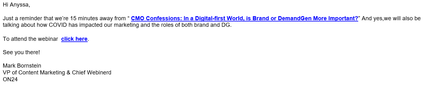
Humanize your text emails as often as possible by addressing the recipient by name, and having the featured speaker sign off (see example below):
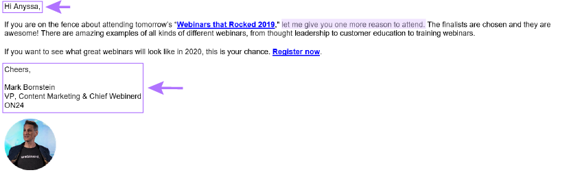
Finally, don’t forget to send an “On-the-Fence” email. Send your final promotional email the day of the webinar to people who’ve opened previous emails but did not register. (Kudos to the speaker if they write these themselves 😉.)
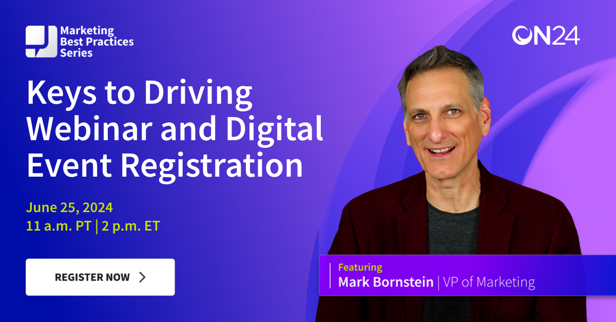
Here are a few other promotional email tips Chief Webinerd, Mark Bornstein, highlights in our webinar “Keys to Driving Webinar Registration and Attendance.”
6 Promotional Webinar Email Tips:
-
- Acknowledge interest without being creepy
- Use plain text for personal approach — this works best if the email is sent from the presenter
- Tease out your webinars about over a series of email sends
- Drum up attendee excitement for the live event
- Make sure everyone knows there’ll be a webinar recording
- Always, always double-check the registration link
2) Personalizing Emails
Personalization means adding a human element to your emails and knowing who your audience is and what types of emails they ought to get. For example, if you have multiple target segments that you want to reach, make slight copy changes so each email is tailored to each respective audience.
Personalization can get complicated quickly, especially if your campaign contains different industries in different timezones for the same virtual event. You’ll need to know how to address and differentiate between prospects, customers, verticals, funnel stages and more.
3) Test, Test, Testing!
Testing emails is the spice of the marketer’s life. Establish a few hypotheses and set up some A/B tests to see how they bear out. For us, we usually test everything from layouts and emojis to subject lines and time of day to optimize the registration process. Just be sure to focus your tests on one element at a time. That way, you can carry over what works.
Here are a few examples of what we’ll play with:
Different layouts
VS
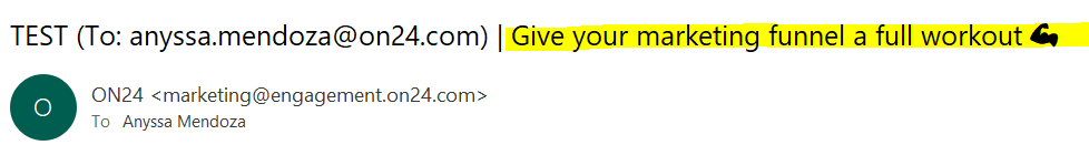
Emoji vs No Emoji
Note: If you’re using Marketo, you’ll have to generate a code to add an emoji to the subject line. Subject Line Assistant is a useful tool in this regard.
Different Subject Lines
A/B testing is central to refining email programs and is a great tactic to hone in on the rhetoric that connects. For example, we’ll often run two pairs of subject lines and pre-headers in our sends:
-
- Subject Line A: Convert webinar leads to pipeline
- Subject Line B: Learn the art of converting webinar leads
-
- Pre-header A: Register now and learn how
- Pre-header B: Register now
Social Media Promotions Done Right

Social media promotions should start at the same time as your emails. This allows you more space for you to share your event. When promoting to social, don’t forget to shorten URL links to registration pages through services like bit.ly and others.
4) Hashtags
If you’re going to use a hashtag (and you should, especially for a recurring series), just remember to be consistent in its use and incorporate other popular hashtags to reach targeted audiences.
5) Scheduling Posts
Set your promotional posts to fire at least once a day during the run-up to your event. Also, make sure to incorporate creative images. Each image should be consistent (no stock photography!) and designed for the social media site where it’ll be posted. Check out this asset guide checklist to learn more!
Finally, note when and where your social media posts are being published. For example, a message posted at 11 a.m. EST does little to help promote an event running at 2 p.m. in Australia.
On-demand nurture with webinars

6) CTA for the Next Event
Every content touch is an opportunity to promote your next event. Use your webinars to promote your next event with interactive tools like ON24’s CTA widget. You can also promote the next event you want to drive attendees to in a post-event email.
A confirmation email is another great opportunity to drive your webinar attendees to additional on-demand content, like customer stories, previous webinars and digital content they can engage with. Doing so can help you collect more insights on what your participants are looking for — like content on professional development, continuing education or technical deep dives.
And, lucky for you, you can help encourage audiences to continue their content journey with a single, centralized solution…
7) Content Centers
Content centers, hubs and resources pages, like those powered by ON24 Engagement Hub, are another great way to allow website visitors to register for an event. You can also create an upcoming events page or create pre- and post- blogs based on your webinars that add registration opportunities.
Speaking of registration, make sure you make it easy for prospects and customers to say “yes.” For example, formless registration provides a seamless, one-click registration experience audiences love (more on this below). Keeping sales teams abreast of marketing activities can also expand your event’s reach – especially if you arm them with social media and creative assets they can use on their own time.
8) Nurture with Webinars
Finally, a lot of energy goes into producing a successful webinar, so don’t let that hard work go to waste! Create nurture streams for your best evergreen webinars. That way, audiences across the buyer’s journey can get a rich, branded experience. You can even bundle up similar webinars and re-use them in a mini-series or package a set of webinars as a guide or lesson plan.
Converting Registrants to Attendees

Registration seems hard, but it can be easy compared to driving attendance. As you work to turn your would-be attendees into actual attendees, remember: every audience is different, so once again…test, test test!
Here are a few things to keep in mind:
9) Play around with reminder emails
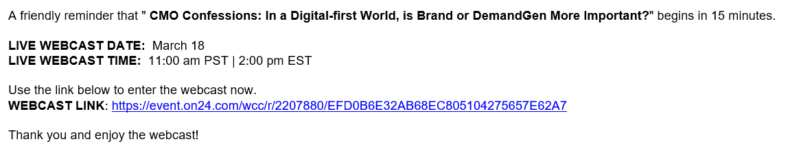
Reminder emails are your best friend when it comes to driving attendance. Most registrants will forget they’ve signed up for an event and need a little nudge to attend! Just remember to send different reminders to different groups at different times. My favorite times to send reminder emails are five minutes before or after an event starts or exactly when the event starts.
When you send a reminder email, you have two choices: personalized or generic. Personalized emails should come from a person involved in the webinar (typically the host). Generic emails should be short in copy and straight to the point: attend.
10) Personalized vs Generic Reminders
We tend to do a 50/50 split for these two emails on the day of your webinar. Send one quick note from the speaker to one half and a generic email to the other. Here’s an example:
VS
11) Incentivize Attendance
Depending on what the goal for your webinar is, you can incentivize attendance with prizes, unique downloads or even locked or privileged information. Just make sure you inform people that anyone attending will have opportunities to win prizes (swag) or get exclusive content during the live webinar.
12) Play with your Webinar Dates
At ON24, we typically hold webinars on Wednesdays at 11 a.m. PT (2 p.m. ET). Thursdays are another great time, but when you host an event is really up to your audience. We’ve found that Fridays are starting to prove successful as well. Play around and find out when your audience likes to tune in.
Don’t forget: audiences can attend your webinars at any time. Make sure your webinars are pushed to on-demand so would-be attendees can tune in when they’d like. We find the best results for on-demand events happen when you make post-event viewing possible within 24 hours of the live broadcast.
Other Registration-Driving Tactics to Consider
Driving webinar registration and attendance is a complicated project. A good promotional plan can work, but don’t forget the other side of the sign-up equation: the registration form. To help you refine your landing pages and drive webinar registrations, consider these tips:
Refine Your Webinar Registration Form
The registration form is often the greatest barrier between you and your audience. The common webinar registration form template is long, tedious to fill out and often asks too much of your would-be attendees.
Consider cutting down on what your form field asks of your audience. Have an event for a specific industry? Maybe drop the “industry” field. Wonder how your registrant heard of your event? Save that question for the post-webinar survey. Oh, and phone numbers? Drop them. Let your audience tell you when they’re ready to meet through a Book a Meeting CTA.
Of course, marketing teams shouldn’t remove a form field on their own. Take the time to talk with your sales team and discuss what *must* be on a registration form, what’s nice to have and what can be dropped entirely.
This is also a good opportunity to consider progressive form fields, which gradually ask for more information about your registrants as they return for more content.
One-Click, Seamless Registration
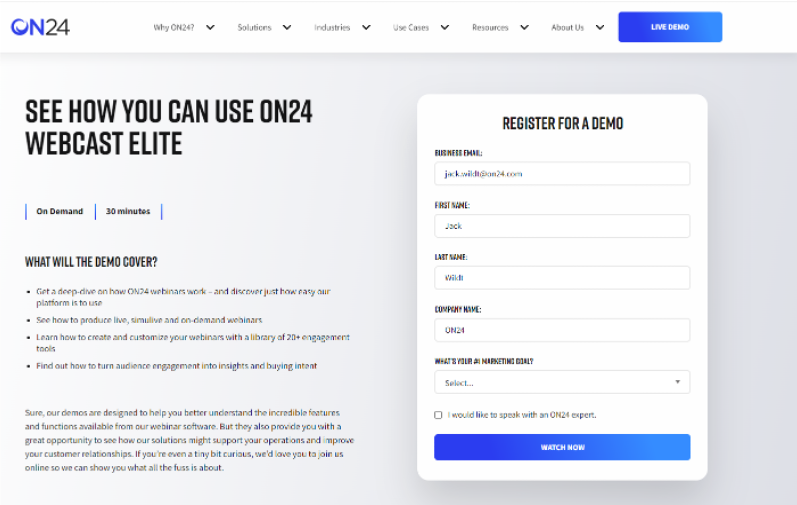
Looking to get audiences into your event even faster? Try updating your webinar registration page with one-click, seamless event registration.
The idea behind one-click registration is pretty simple: one button to register audience members for upcoming or on-demand webinars. This feature, exclusive to ON24 Webcast Elite and Engagement Hub, provides previous webinar attendees with the option to click to register for an online event.
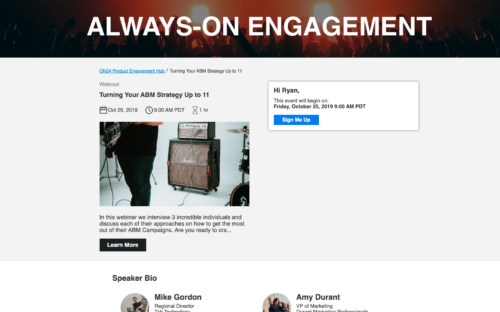
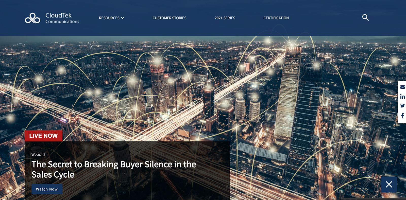
Take Advantage of Interactive Content Hubs
Earlier, we mentioned using content centers and hubs to help audiences to continue their content journeys. A good content hub empowers visitors to sort your content by webinar topic, content type, industry, use case and more so they can find the content they want.
These digital experiences are excellent tools for driving webinar conversions — not just on-demand conversions. A well-designed virtual event platform can unify live and on-demand engagement in a seamless attendee journey.
With Live Content, an Engagement Hub feature, webinar producers can embed a live webinar directly into a content hub for easier viewing. This one-two combination of live and on-demand content provides viewers with the latest live content while still being able to access and consume on-demand content. Especially handy in the event of a product launch.
And that’s it! Just remember to have fun and experiment with your webinars to hone in on your optimal registration and attendance path.