


Let’s say you’re presenting a webinar and everything is going smoothly. You’re charming (of course you are! No, really, you’re more charming than you know), making great points about your solution and your attendees are asking questions. Except, their questions are “Can anyone else read those slides?” and “What’s going on with those colors?”
Sadly, you’ve fallen into a familiar trap. In all likelihood, you brought your PowerPoint presentation habits into your webinar deck.
Slides in webinars are different from those in a PowerPoint presentation. The text in a webinar’s slides needs to be bigger. Their bullet points need to be fewer. They need to be instantly readable and understandable without distracting from your presenter’s overall points. They need to accentuate you, the presenter, and your story, rather than acting as a white paper in slide format.
Toxic webinar slides can kill a great webinar. But don’t worry — here are four quick and dirty tips to help you detoxify your webinar slides:
Tip One: Declutter your slides
The first webinar tip for making a better webinar slide deck is to declutter. Strip your webinar slides of unnecessary text, pictures, graphs — any element that either doesn’t add to your story or — and this is an important bit — tries to tell your story for you.

This is a busy, busy slide! In fact, it’s too busy to provide any meaningful takeaways on its own and would be terribly distracting if the presenter needed to highlight a single item. Not only that, but the text is far too small for any attendees to read (more on this in a moment). Your first of 4 webinar tips is to simplify your webinar life with simplified webinar presentation slides.
Tip Two: Boost your font size
Take a look at this:
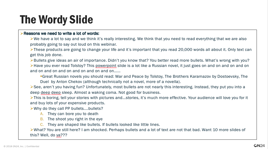
Oh, boy. That picture says and contains about a thousand words, doesn’t it? This is an extreme example, sure, but if you were to present such a word-dense slide during a webinar, you would be able to hear your attendees collectively squint to make any sense of it.
Here is how to clean-up a text-heavy slide. First, make sure your font sizes are at least size 24 or over. Why? Because when you’re giving a webinar presentation, your webinar slides will appear smaller than you’d anticipate — especially if you’re used to speaking to in-person and projected slides — which means you need to boost your font’s size to make it legible.
Second, make sure you have a readable font. Avoid the goofy fonts like Comic Sans and Papyrus that are distracting and hard to read in a small window. Personally, I prefer the easy-to-read Franklin Gothic Medium.
Third, and this loops back to tip one, avoid over-saturating your webinar presentation slides with text. Slides need to enhance the story you’re telling first and foremost and be readable at-a-glance, second. Bold your key points to make them readable and have them speak to your story. If you’re relying on your webinar slides to tell a story you’re delivering webinars all wrong.
Tip Three: Get your colors right
Colors are weird. And I don’t mean that in an existential sort of way. I mean using the wrong colors in your presentation can make your webinar look weird and distracting to attendees — even if they look perfectly fine to you as you prepare your webinar slides.
There are a few rules-of-thumb to go by when it comes to colors in your webinars. First, avoid pastel colors. I know they look pretty, but they don’t translate well to webinar presentations.
Second, avoid slides with too many colors. Having more than two or three prominent colors in your webinar slides — especially in the background — will make your presentation busy and distracting.
Third, when you do use color on a slide — or on your console — make sure there’s a predominant color (typically just one) that provides a reliable contrast to your slides, text, and windows.
Tip Four: Use pretty pictures to tell a story
Finally, if appropriate for your event, add some slides that are just some simple images. Pictures, if you will. Simple pictures are a great way to slow down your event and highlight an important point you want to make.
Have a nice analogy involving ships? Well, simply push an image-based slide and talk to it. You don’t even need to include any text! You could spend a good minute or two discussing the direction your organization or profession is going with an image as simple as this:

Image-only webinar slides are great for webinars because it both provides you with the opportunity to give a subject-appropriate analogy or metaphor while gently guiding your audience’s ears to what you have to say — not what you’re showing. Image-only slides add focus and structure to your presentations without you having to pause on a slide that’s not wholly relevant to the story you’re telling.
They can also add some much-needed breaks in long webinar sessions. Need a moment of relief? Want to send out good vibes? Then consider adding a picture of a furry little kitten to your presentation.
After all, who doesn’t like kittens?
Your webinar presentation slides are one of the most important parts of a webinar. By taking the time to detoxify your slide, you’ll ensure your attendees can easily follow along with you, understand your story and help you produce even better events. Happy webinaring!
Want more webinar tips and tricks? No worries. Head on over to our Webinar Best Practices Series section here. If you’d like to see the episode this post is based on, just click here.